Overview
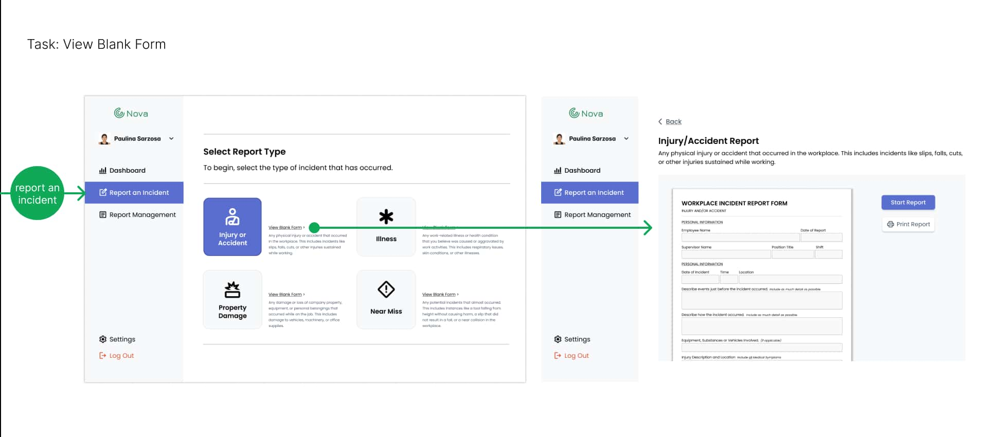
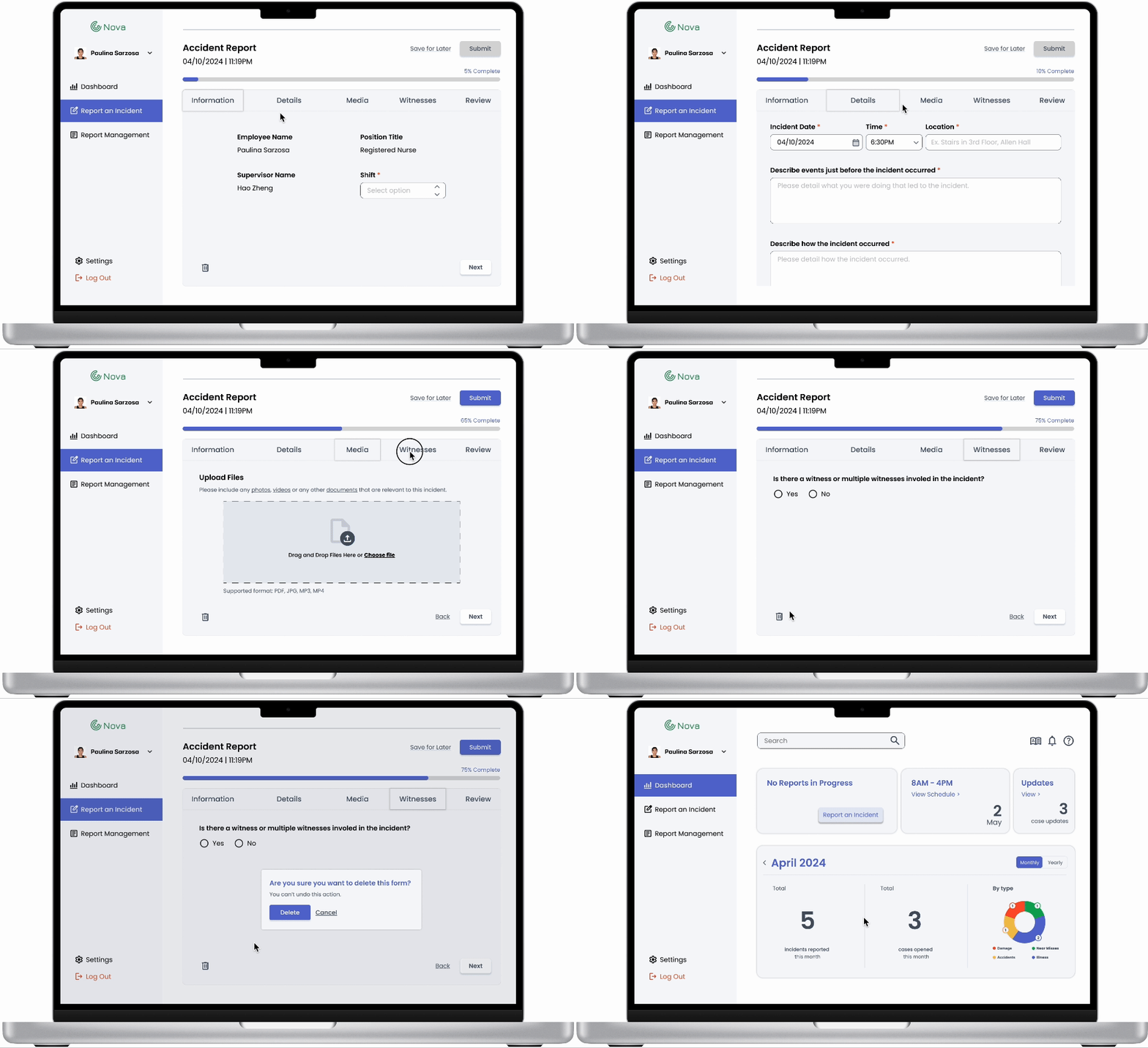
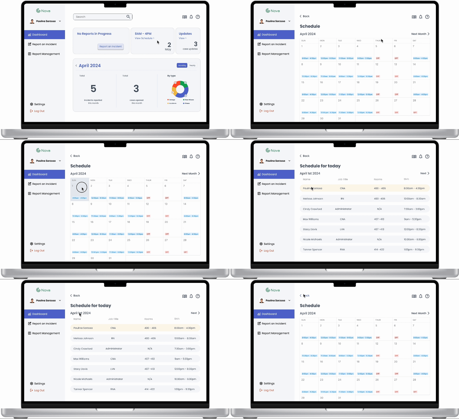
Nova is a a web-based error reporting portal that is designed for nursing home staff members. With Nova, nurses can easily report incidents that occurred in the workplace, access previous incident cases and view relevant incident data in their dashboard.
Nova addresses the problem of underreporting which inhibits organizations from gaining important insights and taking proactive measures to prevent future incidents. This portal provides a user-friendly interface and streamlined task flow, making incident reporting accessible and efficient for all employees.
Recognition
Best UX/UI Design
(2024 Interactive Media Showcase - The University of Miami's School of Communication)
Role
UX Designer
(3 person team)
May 2024
(8 weeks)
Skills & Tools
Ideating
Prototyping
User Testing
Collaborating
Figma
I began this project by conducting some general research on the current state of error reporting systems in the workplace.
Questions I Considered
What is the importance of error reporting?
Why is underreporting a problem?
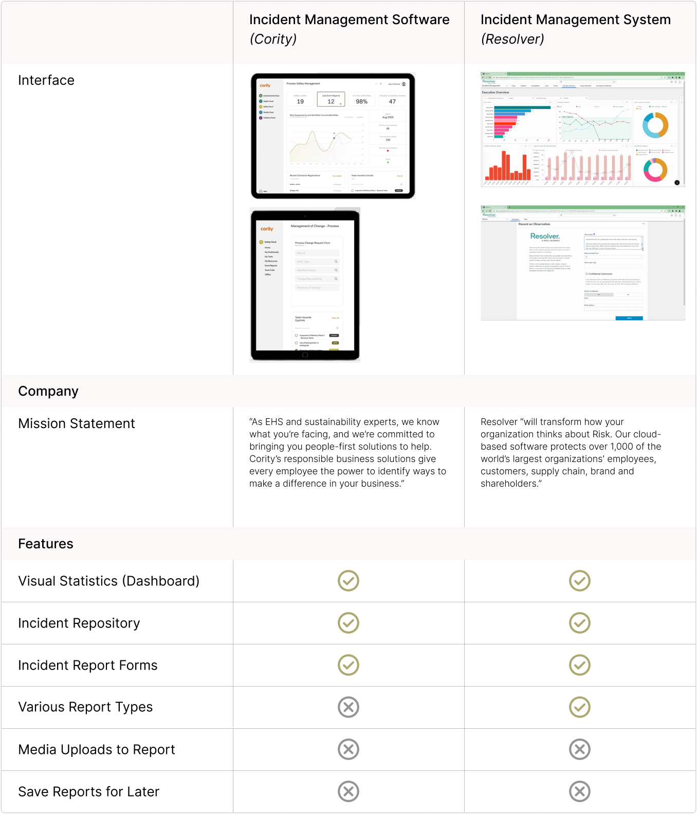
How are current systems trying to solve the problem of underreporting?
Insights
Incident reporting plays a huge role in improving the safety of workplaces across all industries.
Staff often does not report incidents due to poor system design or the unwillingness to learn how to use it.
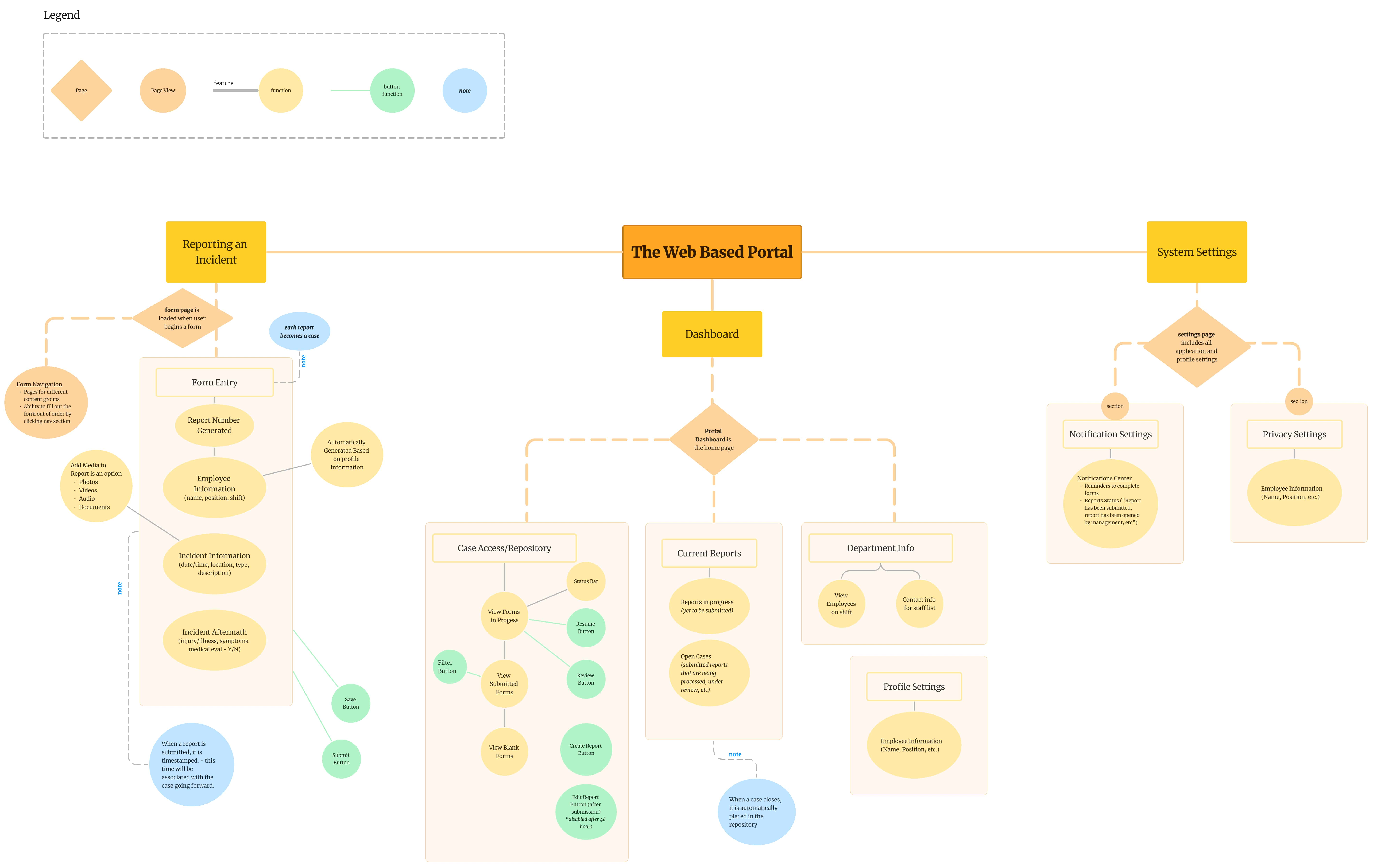
I created a concept map to guide the team through the design process. A general dashboard, incident reporting and a system settings are the main features of the system portal. From here, user tasks were identified.
The team designed wireframes bases on user task flows. I was responsible for designing the following:
Logo
Color Palette
Typography
Iconography
Components
An early prototype was created for user testing ->
Participants were encouraged to think out loud as they used the application. Using a feedback capture grid, they offered their ideas, questions, likes and dislikes about the application.
I made the following changes upon considering user insights:
Participants struggled with various dashboard elements. I addressed this by updating the terminology on the 'In Progress' element (to clarify functionality) and making the incident summary elements interactive (to provide a direct route to the report management page.)
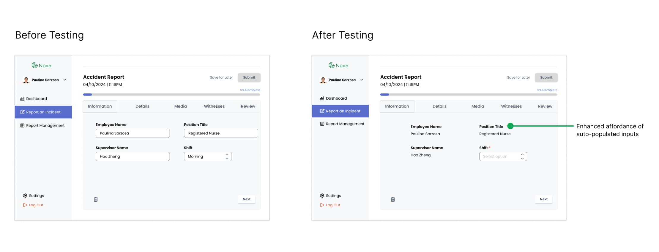
It was not clear to participants that inputs in the 'Information' section were auto-populated. I addressed this by replacing these input fields with static text (to enhance affordance.)
Participants felt overwhelmed by the 'Review' section. I addressed this by visually separating each form section and removing input fields (to improve readability.) Clicking the 'edit' button for each section navigates the user back to the corresponding section within the form.